The University Libraries website is a busy place, with over 17,000 daily views when classes are in session. The homepage is really the front door of the U Libraries for undergrads, graduate students, staff, instructors, and faculty to use everyday to find the sources and services they need for research, teaching and learning.
In early August, that front door will get a metaphoric new coat of paint. This is not a massive redesign and instead we are primarily moving more tools up on the page and added some new content that users expect to find including study spaces and events.
“Our libraries are busy spaces with speakers, workshops, and exhibits. The site will help users connect more easily with these activities, as well as make it easier to find reservable study spaces,” said Phil Dudas, Information Services Manager at Wilson Library.
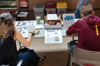
Over the past two years, we have been gathering data about users’ priorities through usability testing. We have used a variety of methods including a popular “donut test” where in exchange for a donut users spend five minutes highlighting parts of the site they think are important, as well as parts of the site they find confusing or unnecessary. Over 125 donuts were consumed during various rounds of testing. The Libraries Web Development team worked through several iterations of the homepage before arriving at the final design.
The design continues to be a flexible, responsive design that is optimized for smartphones and tablets. We also continue to focus on speed with a fast load time that users expect. As in the past, users will be able to “Chat with a Librarian 24/7” but now it is expanded in our site navigation so users can get help from wherever they are in the site.
Highlights of the new libraries homepage
- Hours and locations for our biggest locations are more prominent. During our data gathering, students consistently cited this as content they expect and want on the home page. Connecting students with our 12 on-campus libraries is important.
- We made study space easier to find. With over 50 reservable group study rooms this feature is vital for busy students.
- We added a quick link to peer tutoring. The Libraries host a wide variety of peer tutors including at the SMART Learning Commons in Walter, Wilson, and Magrath libraries. Tutors can help students with their coursework, research papers, video projects, or Student English Language support.
- We added a section called Library Perks. This is a place for our unexpected services, tools, and spaces. We hope to increase awareness of these “perks” such as our online newspapers, study and test prep tips in Effective U, and popular books for fun reading.
- Databases and E-Journals are condensed into one shortened “Highly Used Databases” list from the previous 13 databases and five journal titles. Usage statistics and usability testing showed the links weren’t preferred.
- Services like Interlibrary Loan, which recently expanded to include the scanning and e-delivery of articles and book chapters from our print and microfilm collections, are more prominently featured.
“Whenever we make changes to a site that people are familiar with there can be confusion,” said Cody Hanson, Director of Web Development for the Libraries. “Though we strive to make the site as intuitive as possible, please contact us with any comments or questions.”


