By Allison Campbell-Jensen

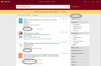
Some of the search-result terms revised by the Libraries’ “dejargonators” to improve the user experience.
From “recall” to “permalink,” libraries are rife with insiders’ specialized jargon. Language or even icons used on our Libraries website can frustrate or confuse users.
Fortunately, the Dejargonators, a subgroup of the Libraries’ Discovery-to-Access Steering Committee (D2A), are ready to smooth the way. An issue may be brought to the attention of the D2A committee or Phil Dudas, User Experience and Information Services Manager, may hear about it. Or another member of the group, such as Kate McManus, User Experience and Virtual Reference Coordinator, might notice a problem.
However the issue arises, the Dejargonators will gather to brainstorm how to improve users’ experiences. Changes are facilitated by Software Developer Jeff Peterson.
Make it plain

Phil Dudas
The user experience field, Dudas says, has grown over the last couple of decades. As website and search interface technology has evolved, the UX field’s goal is to simplify things and make them as useful and usable and accessible as possible for users. The Dejargonators meet as needed — “there’s almost like a Bat signal,” McManus says — to hash out improvements.
“I find our conversations to be really interesting, and it’s a good way to experiment with ways to make users’ experiences better,” McManus adds. “The group is not a formal one, and we’re really flexible and agile, giving D2A recommendations that can be implemented quickly.”
The group has grappled with the different levels of skills among Libraries’ users, from first-year students to career professors or researchers. In the end, however, Dudas says, “We’ve taken an approach that trying to design something that is usable for everyone benefits everyone. You are not necessarily doing a disservice to that super-advanced user by using plain language.” The approach also is iterative, making changes and then re-visiting some later.
Identifying issues and finding solutions

Jeff Peterson
Some of the issues come with the technology, Peterson says. “The Libraries search platform comes with all sorts of pre-configured language, icons, layouts, etc.,” he says. “When we encounter evidence that the standard language is misleading or confusing, we can usually change it with minimal effort.”
Sometimes the language is hard-coded but, Peterson says: “In most cases, coming up with better phrasing is the hard part.”
Checking out the digital landscape can help.
“When the Dejargonators are trying to solve a problem, we’ll typically check a few of our peer institutions to see how others have approached the issue,” Dudas explains. “We’ve even borrowed from the likes of Google and Amazon, who (while problematic at times) are extremely influential in shaping the experiences and expectations of users coming to our sites and applications.”
No more ‘Permalink’

Kate McManus
During web usability testing, McManus says, “we had one student who got very hung up on the word ‘loans’ . . .. They assumed it was some kind of monetary transaction.” So that was changed to “checked out.” The Dejargonators shared some other examples of their work.
- Changed a “favorites” icon from a pin to a star (a star icon is more commonly used for favorites in everyday tools like Gmail and Google Chrome)
- Changed “View it” to “Online access”
- Changed the label for search results facets from “Tweak my results” to “Refine my results.” We’ve since improved it further, to simply “Filter my results”
- Changed “Virtual browse” to “Related titles”
- Changed “Permalink” to “Get link”
Even though they have a funny name, the Dejargonators take seriously their work of improving the Libraries users’ experiences.


