By Allison Campbell-Jensen
 A couple of years ago, an opportunity arose for those managing the Libraries website when it became clear that they would need to upgrade to a new version of the content management system that undergirds it. Like putting your car up on a lift in the repair shop, says Cody Hanson, Interim Director of Technology Strategies, this fresh look led to the conclusion that it was time for a thorough examination of the website.
Almost a decade of carrying content forward multiple times through previous upgrades had resulted in outdated information, lost links, and lack of clarity. The Libraries’ Web Content Management Committee (WCMC), Research and Learning Directors, and other Libraries leaders decided to “revisit the content and touch it all,” Hanson says.
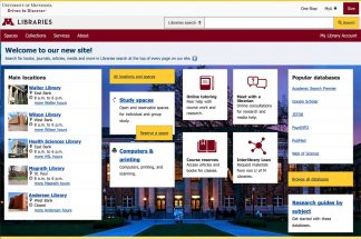
The new website, launching June 29, features concise content in a clear organization.
“Our brand and technology stack can’t be the only elements of our site that evolve and change; our content needs to be capable of that as well, but it can only happen if we’re all on the same page about what we’re doing, why we’re doing it, and how we make it happen,” says Web Content Strategist jen neveau. “Our core strategy statement identifies and prioritizes our core audiences, defines what we want to do for them, and the way we want to do it.”
Wherever a search lands a person, the website will be easily navigable. And all the things that the Libraries do and have — spaces, staff expertise, digital access, services, collections, and so on — will be available in one place.
It’s vitally important because “for many users, the website is the Libraries,” says Phil Dudas, Information Services Manager & User Experience. The Libraries’ website is visited between 1 and 2 million times in an academic year. Thus, as with an earlier, inspiring redesign of the Health Sciences Library website, the goal is to be user-centered.
Who is the audience?
“[L]et’s face it, even people who can read at a Ph.D. level don’t always want to, particularly when they’re trying to complete a task.”
—jen neveau
As part of setting their strategy for the new website, WCMC had to consider whom it was for. After a great deal of discussion, the group decided to put new users first. If new users were able to navigate the website intuitively and faced few or no barriers, then all users should be able to use it well and efficiently. “Because, let’s face it, even people who can read at a Ph.D. level don’t always want to, particularly when they’re trying to complete a task,” neveau says.
Thus a card sort exercise to lay out the new website was not based on organization charts or the Libraries’ needs but instead those of the users. Fortunately, it was completed in person before the pandemic moved everyone to working remotely.
As a result of the exercise, the Libraries’ website top level was divided into Spaces, Collections, Services, and About. The result is greater clarity for users, says Kristen Cooper, Plant Sciences Librarian and WCMC member, and a better picture of the interconnectedness of web elements. Meetings with those in charge of content also resulted in several hundred pages being removed.
“We’re being really thoughtful and intentional about the words we use, and everything is a lot more findable,” says Lindsay Matts-Benson, Instructional Designer and WCMC member.
Website management had been widely distributed but now it will be more centralized, neveau says. In this co-design model, “a central team (WCMC) oversees the content, and works closely with subject matter experts to ensure consistent, quality content delivery across our website.”
To benefit the users, the WCMC also asked those redoing the content to adopt a consistent voice. “University Libraries voice is:
- authoritative, not arrogant;
- transparent, not blunt;
- succinct, not complex; and
- welcoming, but not overly friendly or [with] too much personality.”
The writing style should be active, simple, avoid jargon, and be brief.
Accessibility and sustainability
Being intentional and thoughtful about content also calls for keeping accessibility top of mind, says Amy Drayer, User Interface Developer.
“Don’t use ‘See this,’ because some people don’t use their eyes,” she says. Other people may use assistance technology or navigate using their keyboard, she adds. WCMC members review work by those editing content and so train this cohort to improve accessibility.
“For many users, the website is the Libraries.”
—Phil Dudas
Along with accessibility, the design system’s core principles include being ethical, inclusive, sustainable, responsible, and universal.
Of sustainability, Drayer says she asks: “What is our overall impact on the Earth?” Website designers need to be aware that not everyone has unlimited data plans or access to various devices. “I would cry if I had to write an essay on a phone but that’s what people do.” She advocates for cutting code to use less energy and load pages more quickly.
Gabe Ormsby, Library Data and Technology & Web Development, works with the content management system, Drupal 9, “to find the best ways to use it to meet our information, design, and accessibility/usability goals.” A theme is the part of Drupal that generates the HTML/design presented to the user. “Much of our theme is devoted to taking Drupal’s rather heavy generated code and combing through it to remove everything we don’t need, add some things we do, and bend it to meet the design components we want in the final markup,” he says.
Customization requires quite a bit of coding, but once the site is live, the code can be repurposed across hundreds of pages.
Almost complete
All the reviewing, refining, and reformatting has resulted in a new front door — and a new architecture — at the same address: lib.umn.edu. The website is almost complete. This summer, WCMC, Web Development, and content reviewers expect to continue to revise the website so that it is ready for fall. Users with feedback or questions may use the “Ask a question” form at the bottom of each page or the 24/7 chat service.
For Matts-Benson, the most outstanding part of this website project has been “getting to collaborate with everybody. That there’s common good and desire to do something really cool and useful. We have this vision and then we’re doing everything to bring that vision together.”


